The Department of Homeland Security’s latest recruitment video for ICE has everything: A Jay-Z soundtrack, scenes of ICE agents breaking into homes looking for cartel members that look straight out of a movie, and a font flashed on screen that some say looks uncomfortably familiar.
The type ― reading “Save America” and “join.ice.gov” ― looks a little “Nazi-like,” many on social media noted when it was posted earlier this week. The video was taken down Tuesday due to copyright infringement of the aforementioned Jay-Z song, but you can still find reposts of it around the internet.
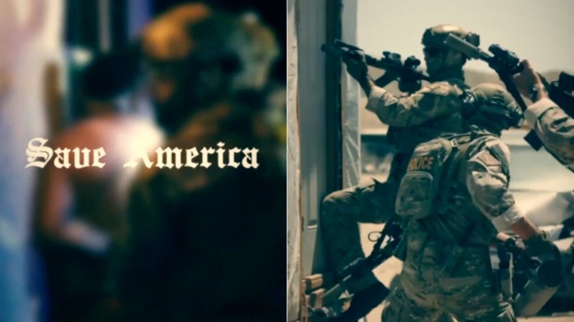
A split screen of “Save America” in the font and an image from the video, showing ICE agents storming a building.
Do experts ― graphic designers and historians who study Nazi Germany propaganda ― see the resemblance in font selection? Some do. Khara Cloutier, a typography instructor in the extended studies program at CalArts in Santa Clarita, California, thinks the comparison is “absolutely relevant.”
“It’s a Blackletter script, and a variety known as Fraktur was used on the cover of Adolf Hitler’s ‘Mein Kampf,’ and early Nazi propaganda,” she said.
It was a popular German national script for centuries, but eventually it fell out of favor with the Third Reich. The Nazis banned the use of the font in 1941, dismissing the type for its “Jewish influence” and for being too old-world.
Jewish writers and printers had tainted the type, the Nazi regime claimed, and the nation needed something more modern and standardized that would allow people in occupied Europe to read their propaganda, according to Jonathan Wiesen, professor of history and author of several books on the Third Reich and its legacy, most recently “Nazi Germany: Society, Culture, and Politics.”
So is it the “Nazi font”? Technically, no, given that the Blackletter font ― and this seems to be a tweaked variation of it ― was used for centuries in Europe, he told HuffPost.
“If you were to ask the people who put together the ICE recruitment video, they would probably offer some plausible deniability ― this font was used by everyone for centuries… was even linked to Jews, it’s not technically the Fraktur, or ‘German font,’” Wiesen said.
But it’s fair to assume that in visual media and marketing, there are almost no accidents, especially with the choice of such a striking and controversial font, he said.
On Bluesky, Philip Cohen, a sociologist and demographer, was among those who noted the similarities between the font used in the DHS clip and fonts used by Hitler and the Nazi regime.
While the font is tied to Nazi Germany ― and is a clear favorite among far-right hate groups in Europe, Wiesen notes (look at the font on the website of Stormfront, a neo-Nazi group) — we see versions of it everywhere, notably mastheads of The New York Times, The Washington Post and other newspapers.
“With the font, they could also argue that it evokes heritage and an older, safer time — in keeping with ICE’s mandate to keep America safe,” Wiesen said. “It’s even sometimes called an Old English font.”
Elon Musk, who’s supported far-right-wing political movements, policies and administrations in at least 18 countries, is a fan of the font, too. He emblazoned his “Dark MAGA” hat with a rather gaudy version of the font while campaigning for President Donald Trump.
With the Jay-Z music in the background, the DHS social media team could also argue that they were going for “hard” or “tough guy” imagery, said Steven Heller, a design critic and author of “Iron Fists: Branding the Totalitarian State.”
“It’s probably more gangsta than Nazi,” Heller told HuffPost. “But they are clearly using the wrong typeface for their message. No police department or Federal police agency is using Old English. I think it’s some typographic ignorant trying to do pastiche but has no idea what to do.”
Bloomberg via Getty Images
The New York Times newspaper uses a similar font in its masthead.
Ironically, given that the ICE raids have largely impacted Latino communities, Old English fonts are incredibly popular among Mexicans, both in the U.S. and Mexico, said Paul Shaw, a design historian and type designer. We see it in brand logos and storefront signs, ornate tattoo designs and graffiti.
It’s “definitely possible that type-illiterate people in the Trump administration are unaware of this” Mexican connection, Shaw told HuffPost.
Here’s why the font, and the ‘military cosplay’ in the clip, are worth talking about.
Why does any of this matter? As digital designer Ben Hersh wrote in a 2017 article for Wired titled “How Fonts Are Fueling the Culture Wars,” typography is a weightier thing than we realize.
“Typography can silently influence: It can signify dangerous ideas, normalize dictatorships, and sever broken nations,” he wrote. “It can do this as powerfully as the words it depicts.”
And it’s not too much of a leap to consider this post a racial dog whistle, given the Trump administration’s tendency to share similarly questionable racially charged content on social media: A day after posting this ICE agent recruitment post, the DHS shared another on X with the caption, “Which way, American man?” — a quote that seems to reference “Which Way Western Man?” a 1978 book by the avowed white supremacist William Gayley Simpson, who argued Hitler was right and led the National Alliance, an American neo-Nazi organization.
As the U.S. inches closer to authoritarianism under President Trump, all of this ― the font, the images, the quotes ― is unnerving, critics say.
“Using the Nazi-esque font is bad, but [the images are] also bad, if not worse,” wrote Princeton University history professor Nate Ledbetter on Bluesky.
“This is military cosplay,” he wrote. “Look at how heavily they are kitted out. The Army didn’t give me all this crap when it sent me to AFGHANISTAN. But they’re wearing all this to arrest dangerous hot dog stand vendors?”
Stills from the DHS’s ICE recruitment video show ICE agents storming homes and other buildings.
The visuals, and arguably the font, are the aesthetics of President Trump’s authoritarian fever dream; a dream we’re seeing brought to fruition in the widespread immigration raids and use of military force in America’s cities and detainments without probable cause (less than 10% of people taken into custody by ICE have serious criminal offenses).
The images in the ICE ad are selling the dream to the public, said Nicholas O’Shaughnessy, a professor emeritus of communication at Queen Mary University of London and the author of “Selling Hitler: Propaganda and the Nazi Brand.”
20 Years OfFreeJournalism
Your Support Fuels Our Mission
Your Support Fuels Our Mission
For two decades, HuffPost has been fearless, unflinching, and relentless in pursuit of the truth. Support our mission to keep us around for the next 20 — we can’t do this without you.
We remain committed to providing you with the unflinching, fact-based journalism everyone deserves.
Thank you again for your support along the way. We’re truly grateful for readers like you! Your initial support helped get us here and bolstered our newsroom, which kept us strong during uncertain times. Now as we continue, we need your help more than ever. We hope you will join us once again.
Support HuffPost
Already contributed? Log in to hide these messages.
“We have to look at what the symbolism is telling us, and that symbolism is an authoritarian patriotism summoned to sustain an enormous act of ― to the perpetrators ― a kind of social cleansing,” O’Shaughnessy said. “It’s visceral and pitiless, and we are going to see much more of it.”